
Exploring Freaky Fonts: How to Make Your Text Stand Out
Introduction: The Power of Font Styles in Design
In the world of graphic design and digital content creation, the right font can significantly enhance the overall aesthetic and message of a project. While many opt for traditional fonts, others explore more unique styles to make their designs stand out. One such category of fonts that has gained popularity is “freaky fonts.” These fonts are distinct, bold, and often unconventional, making them ideal for capturing attention.
But what exactly is a freaky font, and why are they becoming increasingly popular in design? This article will explore the concept of freaky fonts, their applications, and how to choose the right one for your next project.
What Are Freaky Fonts?
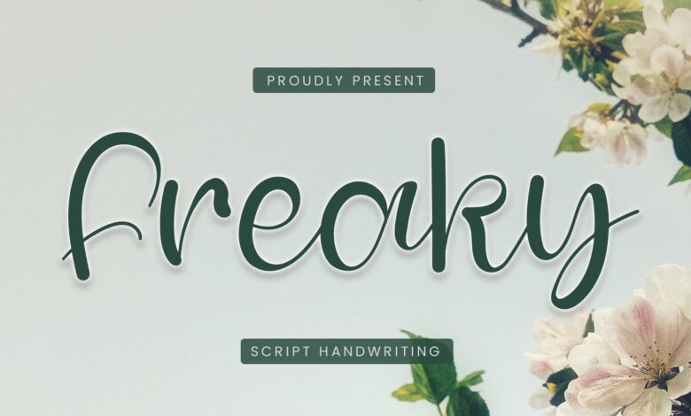
Freaky fonts are those that deviate from the standard, recognizable types used in most professional design work. These fonts often feature exaggerated elements such as distorted letters, unusual curves, quirky shapes, or even a sense of chaos that makes them feel “out of the ordinary.” They may be inspired by horror, graffiti, psychedelic art, or other alternative aesthetics.
The key feature of freaky fonts is their ability to evoke strong emotions or reactions. Whether you’re designing for a Halloween event, a horror-themed project, or simply looking to break free from traditional design norms, these fonts can help you achieve that. They can range from bold and playful to dark and mysterious, depending on the context.
The Appeal of Freaky Fonts in Modern Design
Why are freaky fonts so appealing in today’s design landscape? For starters, they offer a way to break away from the conventional and express creativity in a visually striking manner. In a world where consumers are bombarded with information, standing out is essential, and freaky fonts help achieve that.
Here are some reasons why freaky fonts are popular:
- Attention-Grabbing: Their unique and bold appearance instantly catches the eye, making them ideal for headlines or focal points in designs.
- Versatility in Expression: Freaky fonts can be tailored to suit various themes, such as horror, fantasy, retro, and more.
- Creative Freedom: Designers can use these fonts to experiment with unconventional styles, creating memorable visuals that resonate with audiences.
How to Choose the Right Freaky Font
Choosing the right freaky font for your project is crucial. While these fonts can be exciting, they need to be used thoughtfully. A font that is too wild or difficult to read can confuse your audience or detract from the message you’re trying to convey.
Here are some tips for selecting the right freaky font:
- Understand the Purpose: Consider the mood or theme of your project. Are you creating a horror-themed flyer, a quirky promotional banner, or a modern art piece? Understanding the context will help guide your choice.
- Legibility Matters: While freaky fonts can be eccentric, they should still be readable. Avoid overly complex fonts for body text or small print. Reserve them for headlines or titles where clarity isn’t compromised.
- Complement the Design: Make sure the font complements other elements of your design, including color schemes, images, and layout. A font that clashes with other design elements can make your work look chaotic and unprofessional.
- Experiment with Letter Spacing and Size: Sometimes, adjusting the spacing and size of the letters can help make the font more readable and fit better into the design.
Popular Types of Freaky Fonts
There are various types of freaky fonts, each with its own unique characteristics. Some of the most popular include:
1. Distorted Fonts
Distorted fonts feature stretched or warped letters, creating a sense of movement or unease. They are often used in horror or thriller-themed designs, such as movie posters or book covers. These fonts can evoke feelings of tension, chaos, or surrealism, depending on their execution.
2. Handwritten Fonts
Handwritten freaky fonts are inspired by messy, erratic handwriting. These fonts can look unpolished or wild, often giving a design a rebellious or anarchistic vibe. They’re perfect for designs that want to convey a personal or gritty feel.
3. Graffiti Fonts
Graffiti fonts take inspiration from urban street art, featuring bold strokes and unconventional shapes. These fonts are ideal for projects aiming to invoke youthful energy, rebellion, or urban culture.
4. Psychedelic Fonts
Psychedelic fonts are inspired by the colors, patterns, and themes of the 1960s counterculture. These fonts are often colorful, swirly, and abstract, making them perfect for designs that aim to be vibrant and visually stimulating.
5. Retro Fonts
Retro freaky fonts draw inspiration from the past, often from the 70s, 80s, or 90s. These fonts can incorporate quirky shapes, exaggerated strokes, and playful elements that evoke nostalgia while remaining unique.
Where to Use Freaky Fonts
Freaky fonts are ideal for various creative projects, especially those that aim to make a bold statement. Here are some areas where they are commonly used:
1. Event Posters and Flyers
For events such as Halloween parties, concerts, or film screenings, freaky fonts can help convey the theme and atmosphere. They can immediately set the tone for the event, enticing attendees with their unique designs.
2. Logo Design
A custom logo with a freaky font can help businesses, especially those in creative industries, stand out. The right font can be a memorable part of a brand’s identity.
3. Web Design
Websites looking for a distinct look can benefit from using freaky fonts in headings, banners, or promotional materials. However, it’s important to maintain a balance so that the font doesn’t overwhelm the content.
4. Book Covers
Freaky fonts are a great choice for book covers, especially for genres like horror, fantasy, or graphic novels. The font can play a huge role in attracting the right audience and reflecting the book’s content.
5. Advertising and Marketing
In advertising, grabbing attention is key. Freaky fonts can help your message stand out in crowded spaces, whether it’s a social media ad, a magazine spread, or a billboard.
Best Practices for Using Freaky Fonts
While freaky fonts can enhance a design, they need to be used in moderation and with careful consideration. Here are some best practices:
- Limit the Use of Freaky Fonts: Don’t overuse freaky fonts in a single design. Stick to using them in headlines or key elements, with more traditional fonts for the body text to ensure readability.
- Contrast and Readability: Ensure that the freaky font stands out against the background and other elements of the design. Avoid using too many contrasting colors that could make the font hard to read.
- Align with Your Brand Identity: If you’re using a freaky font for your business, make sure it aligns with your brand’s tone and identity. A horror font might not be suitable for a corporate brand, for example.
Conclusion: Embrace Creativity with Freaky Fonts
Freaky fonts offer a unique opportunity for designers to break free from conventional norms and inject personality into their projects. Whether you’re creating a spooky event poster, a bold logo, or an eye-catching web design, these fonts can make a lasting impression. However, it’s important to choose the right font for the right context and ensure it complements your overall design.
By following the tips and best practices outlined in this article, you can confidently use freaky fonts to elevate your design work and capture the attention of your audience.


Very interesting subject , thanks for posting.